THIS WEBSITE HIGHLIGHTS TWO OF MY CASE STUDIES
Research first. Then the interface.
I'm Alejandro! A UX researcher, product designer and UI designer with a background in software engineering. Below, you'll find my work with reimagining Twitter (now X) Spaces, and a revision of LevelUp Basketball.
Case study 01 · Mobile · 3 months
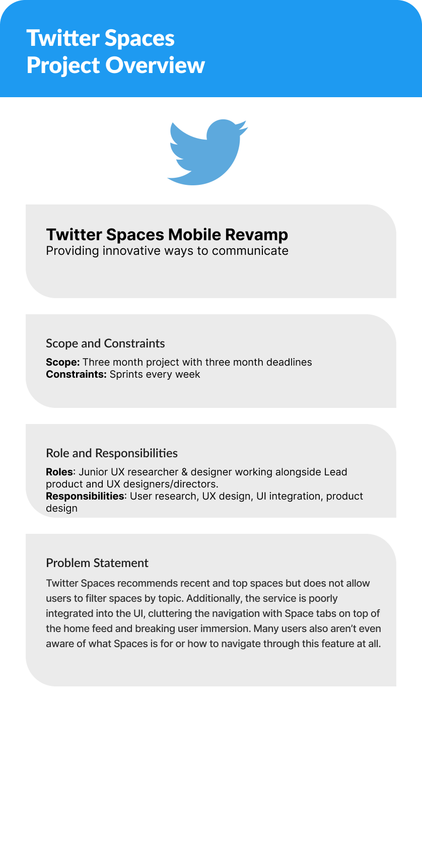
Twitter Spaces Mobile Revamp
Providing innovative ways to communicate.
Problem
Spaces recommends recent and top rooms, but you can't filter by topic.
The service is poorly integrated into the UI, cluttering the navigation with Space tabs on top of the home feed and breaking user immersion. Many users also aren't aware of what Spaces is for, or how to navigate the feature at all.
Research
I wrote a research plan, then let the interviews rewrite my assumptions.
Ten open questions collected demographics and habits — daily Twitter use, how people scroll the feed, whether Spaces is discoverable, whether search works, and what one thing they'd change about the experience. Responses went through affinity mapping, then into insight themes, empathy maps and hypothesis statements.

Hypothesis
I will implement the previously proposed updates to Spaces while simultaneously integrating machine learning algorithms into the Spaces feed, which will improve over time based on the user's interests and usage. By putting the users first and addressing their key pain points, positive changes will be accomplished and brand reception will improve.
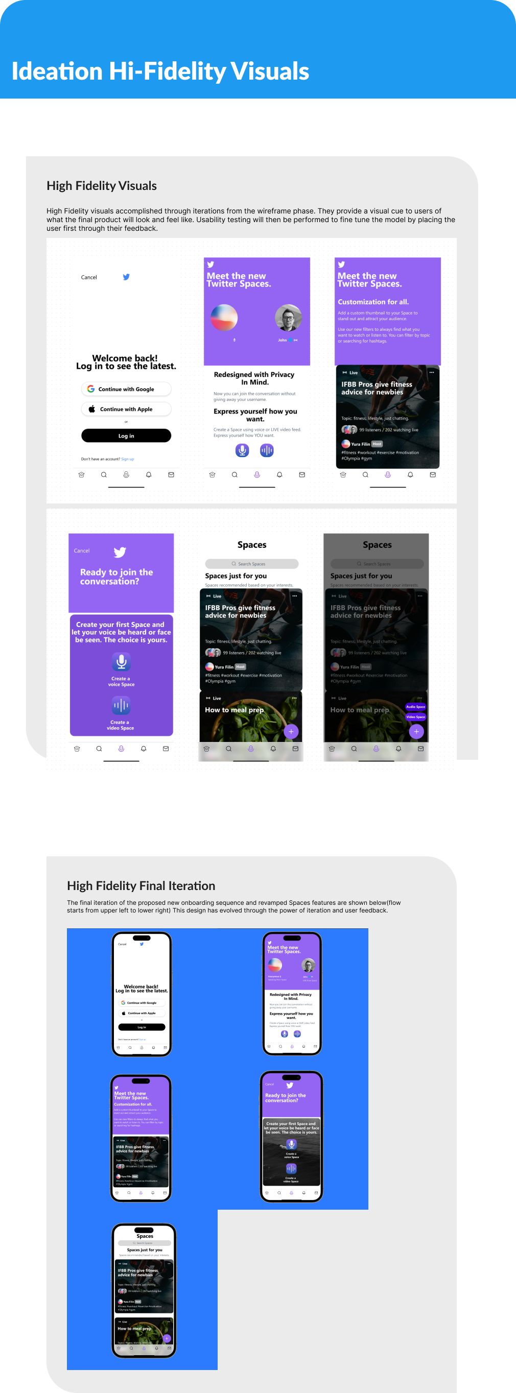
The feature flow that followed: an onboarding sequence for a feature most users had never understood. Pick topics, hashtags and preferences for the kind of Spaces you want in your feed — then choose voice-only or live video to join or create.
Sketches → wireframes
Six sketches mapped the flow for a quick visual mockup and fast iteration. Mid-fidelity wireframes are an evolution of those sketches, annotated with the improvements made across each pass.

Final UI
Onboarding that explains the feature, and a feed that filters itself.
Usability testing & learnings
Things will never go how you planned them, and that's how this work flourishes.
Usability testing fine-tuned the model by putting the user first through their feedback. By keeping the priority of the project on the users, I kept realizing insights that were previously not made clear. Users are like an extra set of eyes to the UX researcher — without them, the iteration process would not work as incredibly as it does. Being challenged should be taken as a blessing rather than a reason for frustration: if there's frustration on the designer's end, imagine how much more frustrating that design is as a pain point for the user.
Case study 02 · Mobile · Team of 9
LevelUp Basketball Research
Keep things simple and stress-free for coaches. Let them focus on coaching, not paperwork.
Guiding question
How can we craft a basketball app that delivers the needs of coaches, players and parents?
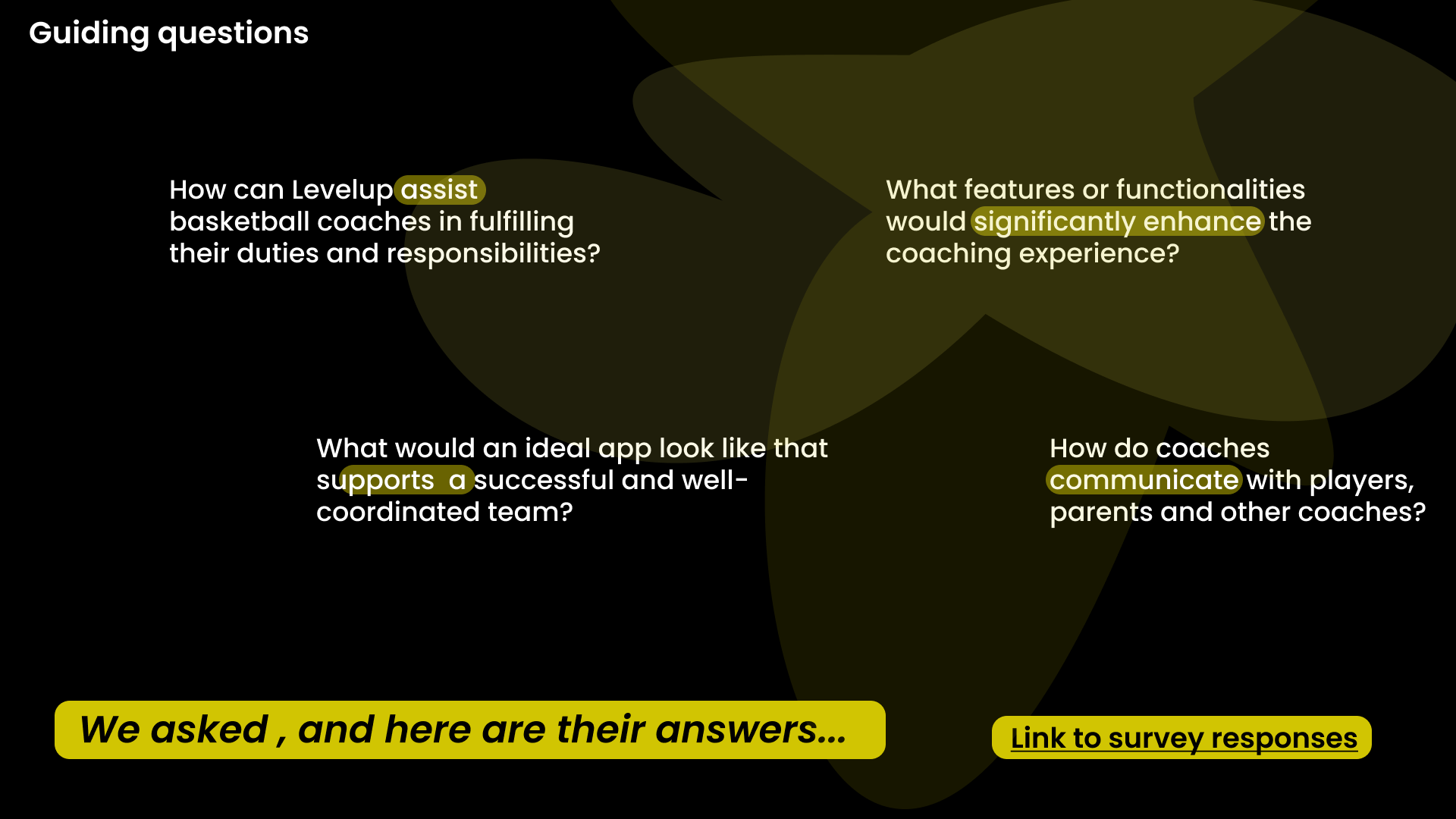
The brief called for something like a Swiss Army knife for basketball enthusiasts: an AI coach, educational content, and a space for a global basketball community. Four sub-questions framed the research — how LevelUp can assist coaches in fulfilling their duties, what features would significantly enhance the coaching experience, what an app supporting a well-coordinated team looks like, and how coaches actually communicate with players, parents and other coaches.
Research
We took apart three products' messaging, screen by screen.
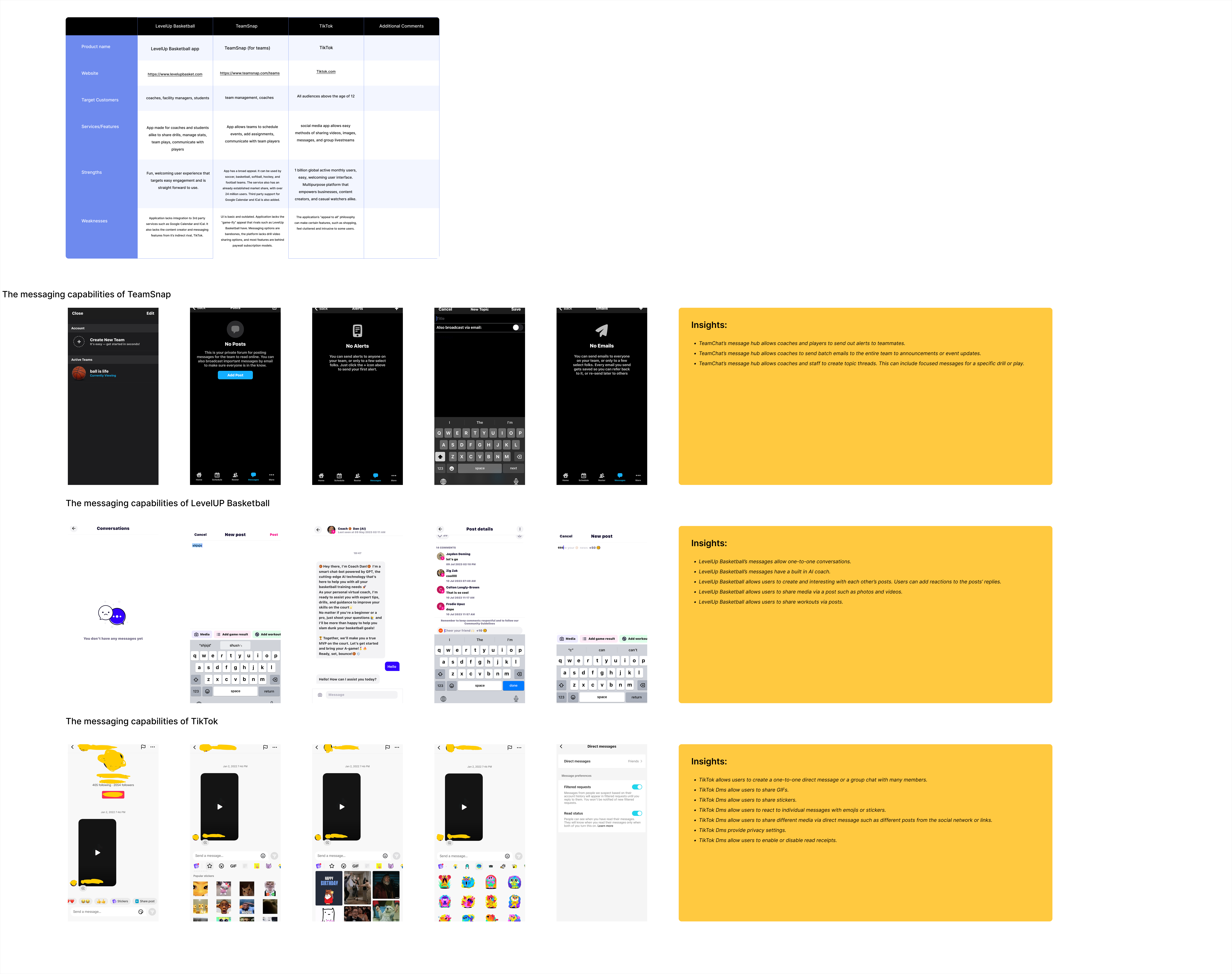
LevelUp Basketball, TeamSnap and TikTok — target customers, features, strengths, weaknesses, then every messaging screen annotated. TeamSnap's message hub can broadcast batch emails and topic threads. LevelUp already had a one-to-one AI coach and workout posts. TikTok's DMs set the bar for reactions, stickers and privacy settings.
Prioritization
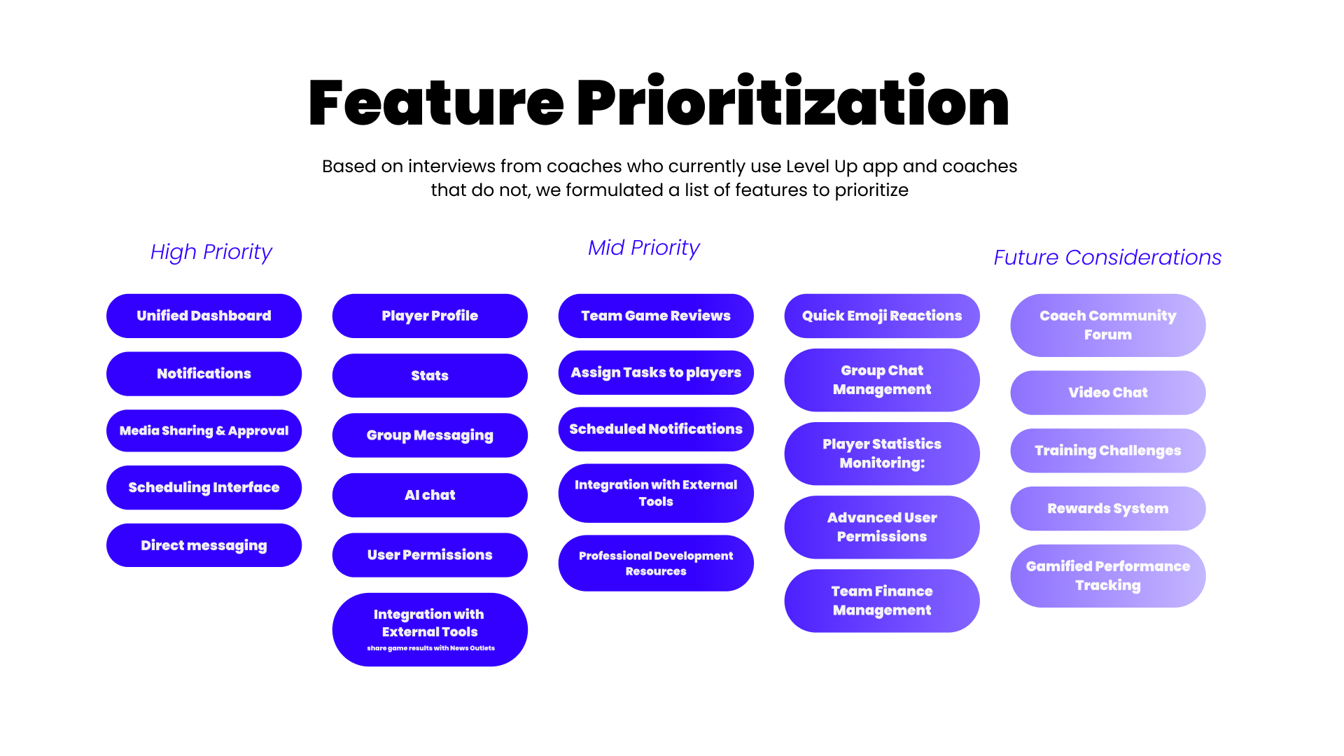
Based on interviews with coaches who use LevelUp and coaches who don't, we sorted features into high priority, mid priority and future considerations. The high-priority set became the scope: unified dashboard, notifications, media sharing and approval, a scheduling interface, direct and group messaging, player profiles, stats, AI chat and user permissions.
Design ideology
A safe and supportive environment for young players, built as features rather than promises.
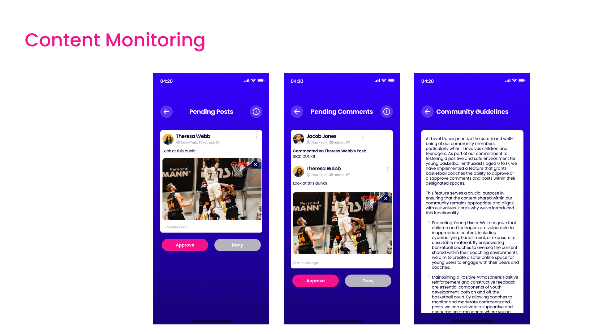
Because the community includes players aged 6 to 17, content monitoring grants coaches the ability to approve or deny posts and comments inside their own spaces. Pending Posts and Pending Comments queues sit next to community guidelines that state the reasoning: protecting young users from inappropriate content, and maintaining a positive atmosphere where feedback stays constructive.
Final UI
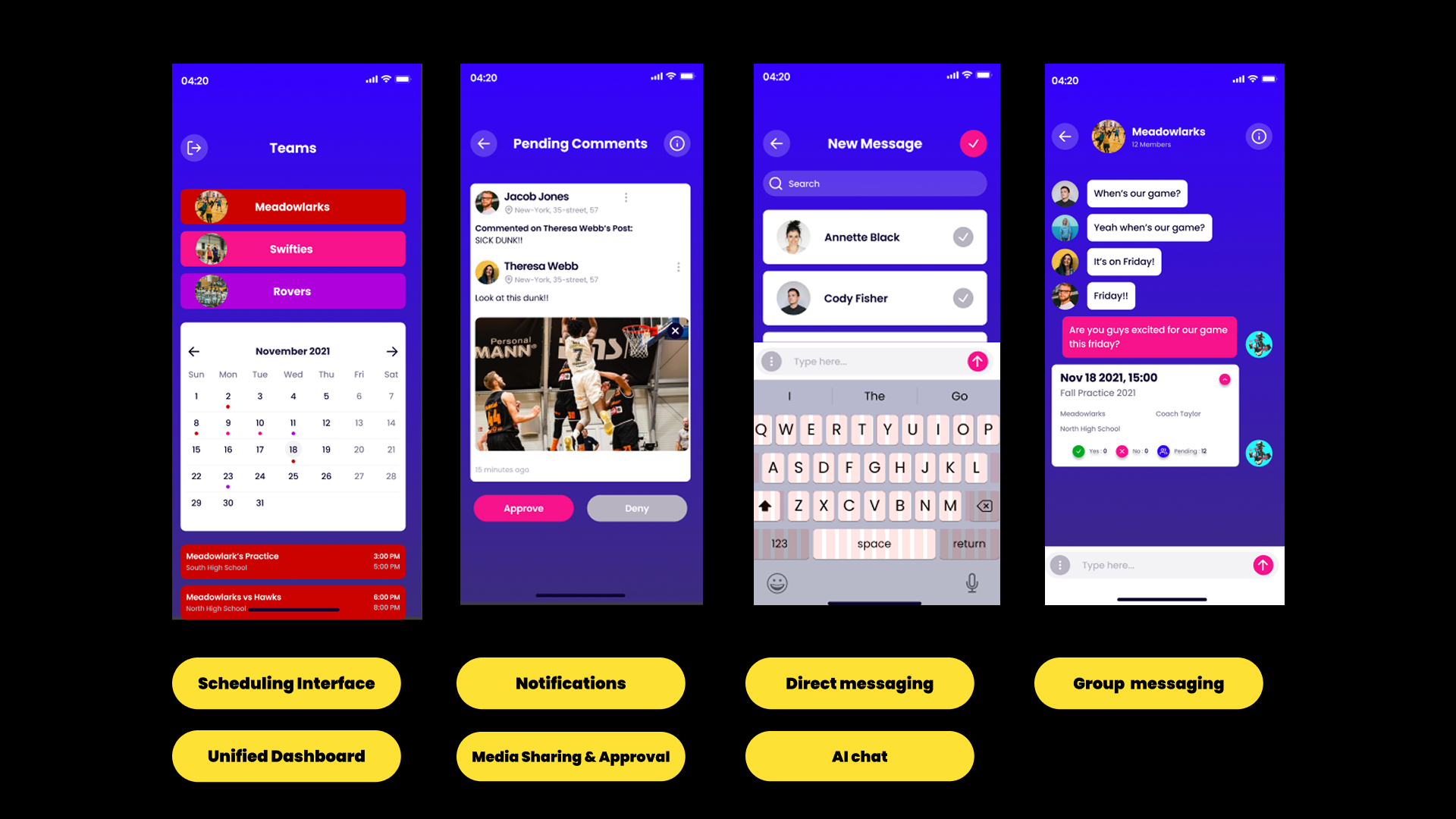
One dashboard for the calendar, the queue and every conversation.
Usability testing
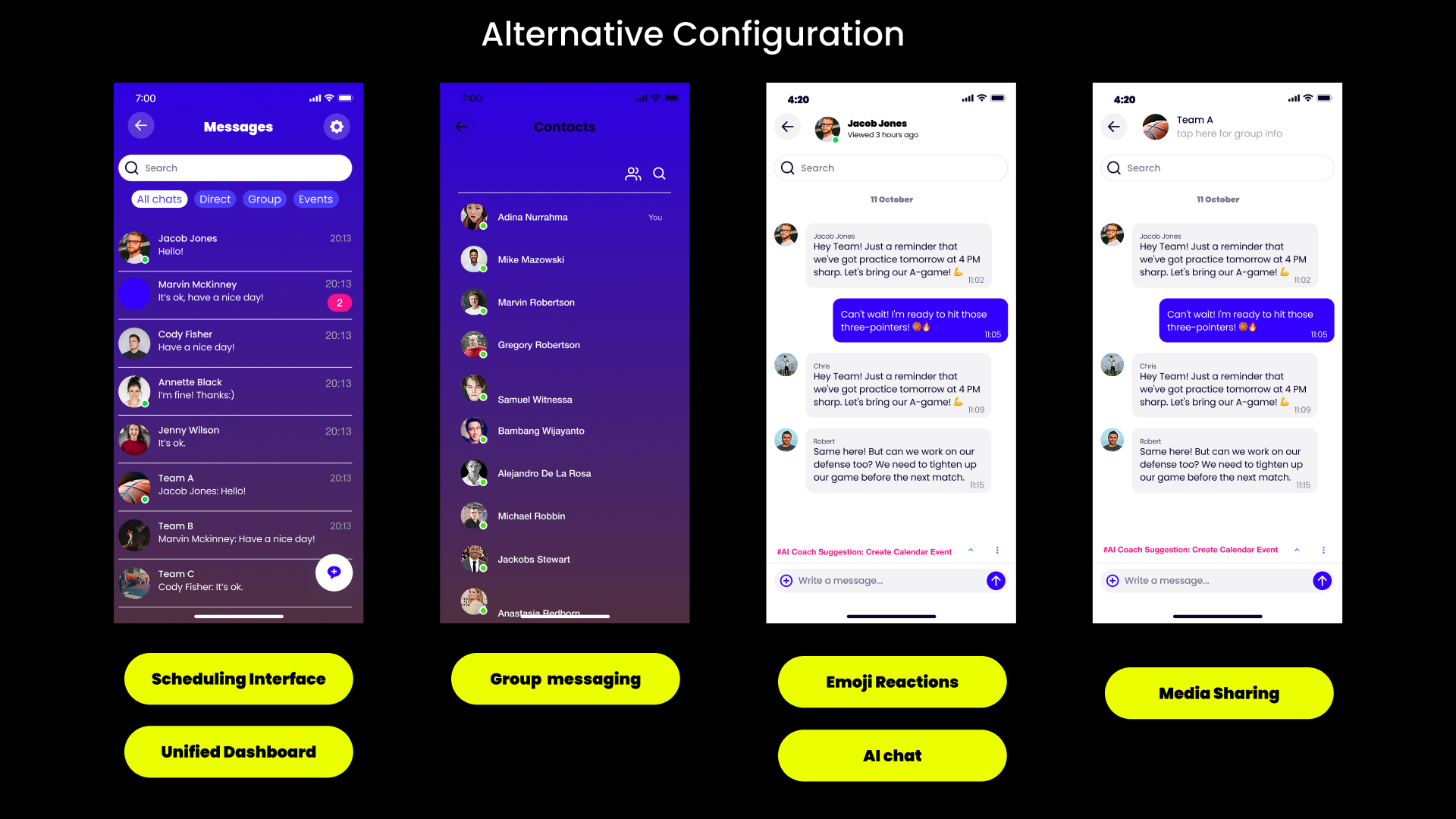
We put an alternative configuration in front of coaches: a lighter chat list with All chats, Direct, Group and Events filters, a contacts view, and AI coach suggestions surfacing inline above the composer. Testing the two configurations side by side is what settled the messaging architecture.
Team
Jenny Nguyen, Sofia, Robin, Rachael Belké, Shakira Mallory, Deepika Raju, Melvin Brown, Alejandro De La Rosa and Megan Jones. Team lead: Bethany Armstrong.
Outcome
Not just an app — a tool that boosts the coaching experience and helps athletes grow.
Research turned a broad brief into a defensible scope: nine high-priority features, a moderation model appropriate for a youth audience, and messaging patterns benchmarked against products coaches already use every day. Whether a non-profit or a pro program, the same flows hold.